Design Goals:
The goal of this project was to create a brand that has a range of products in it which look consistent with each other while also riffing on the brand itself for different applications.

Process:
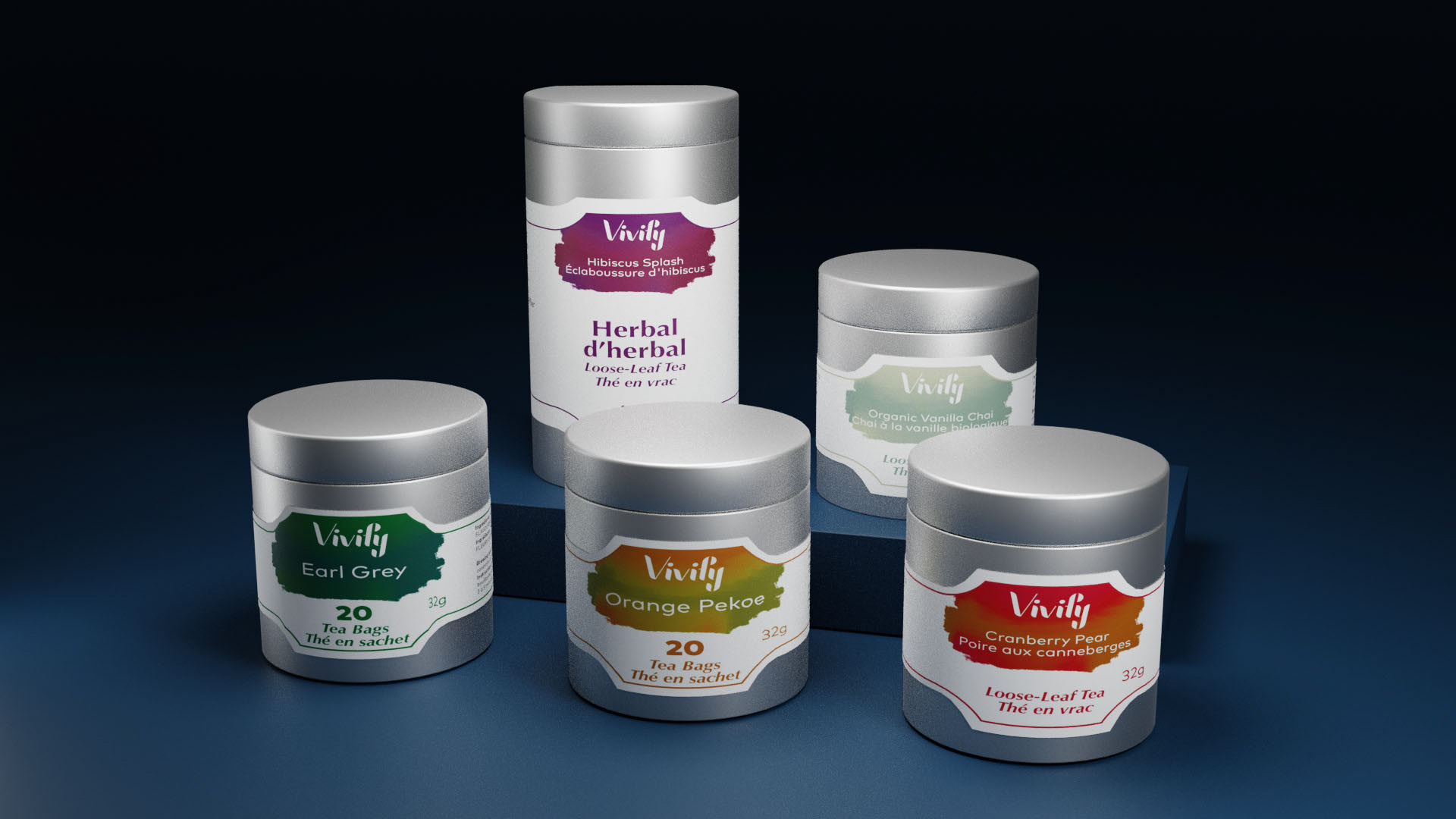
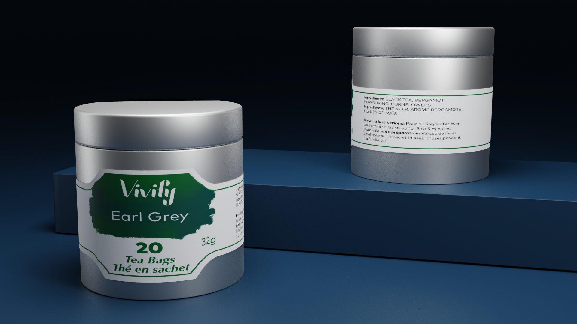
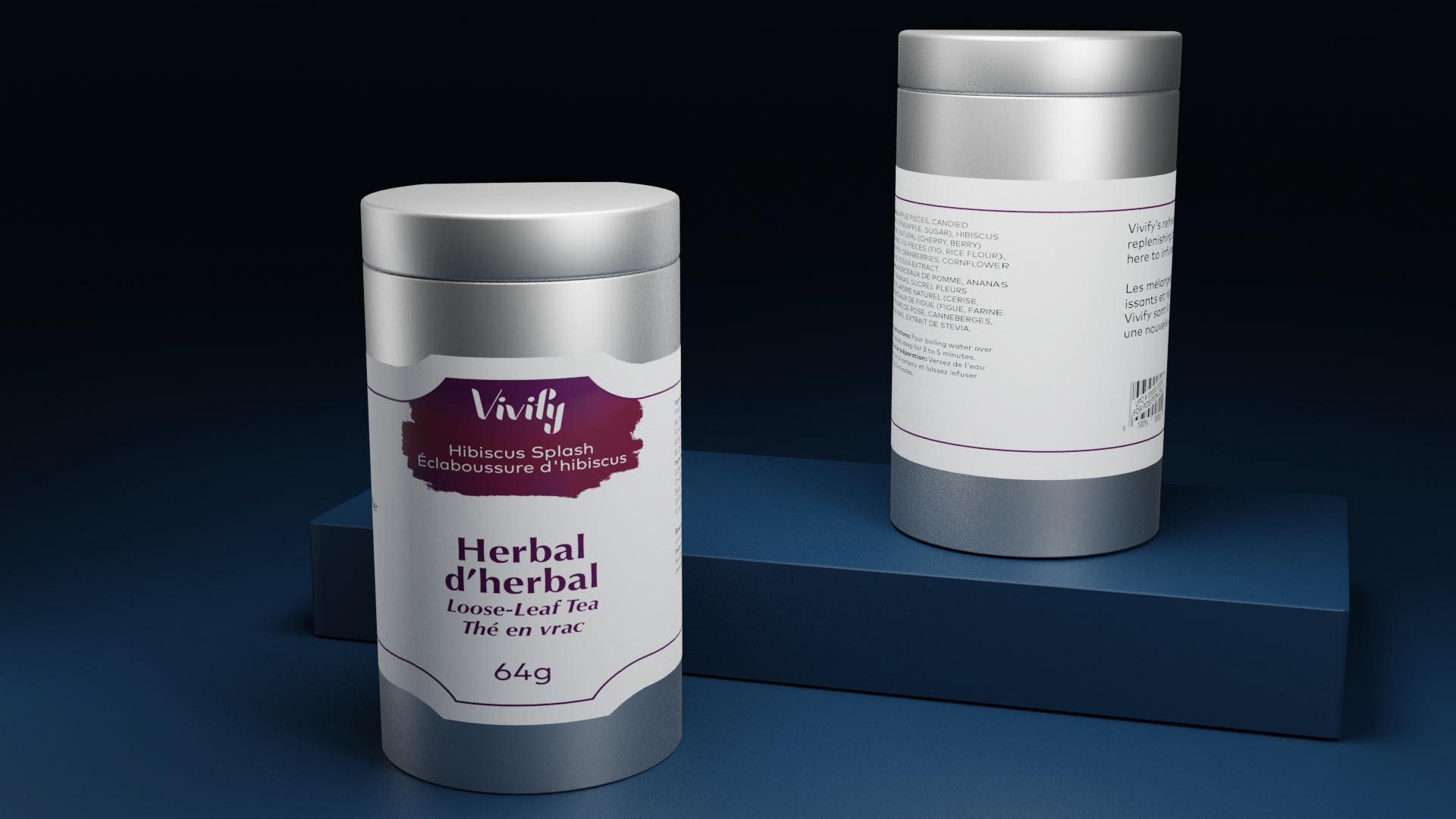
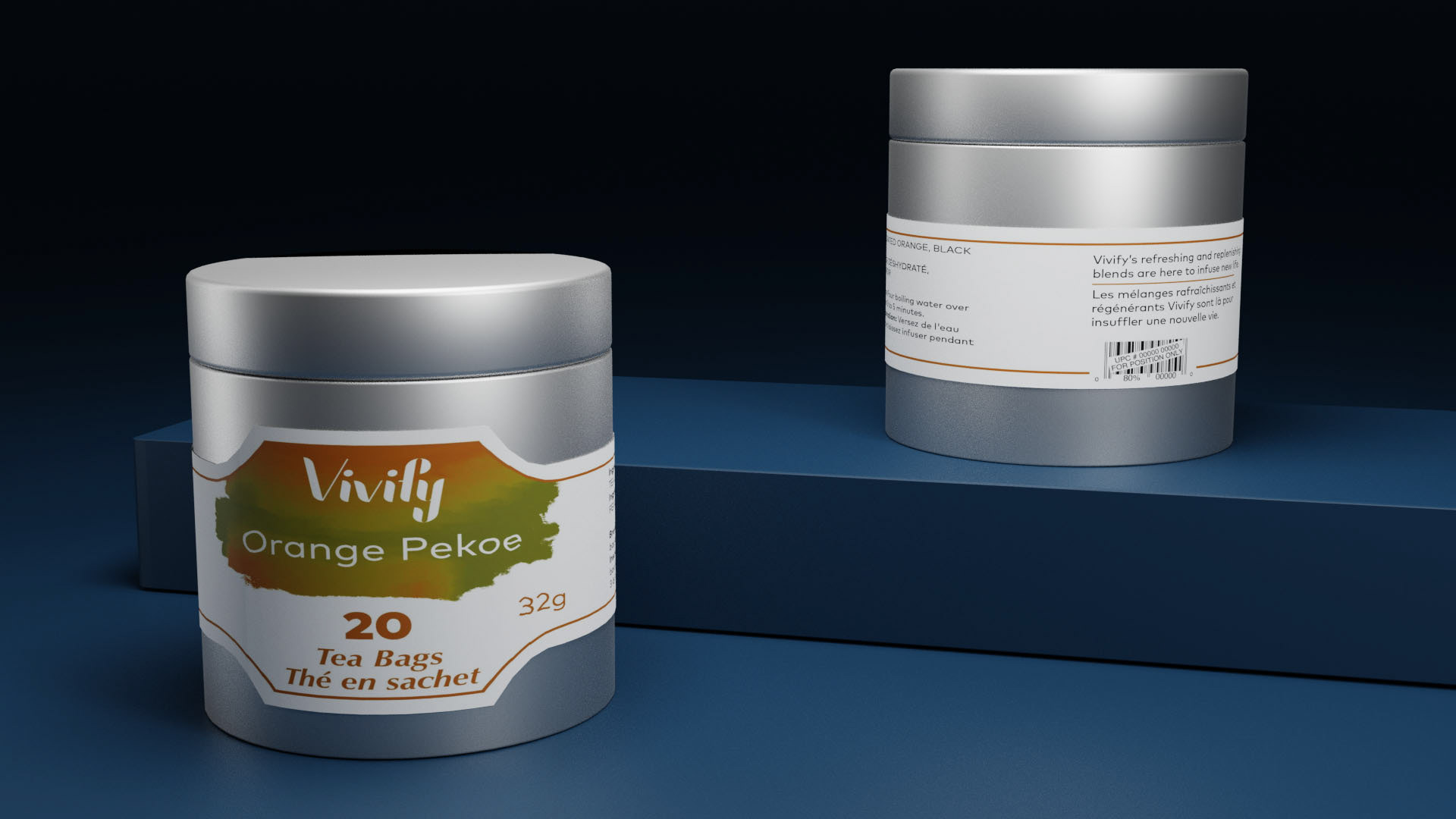
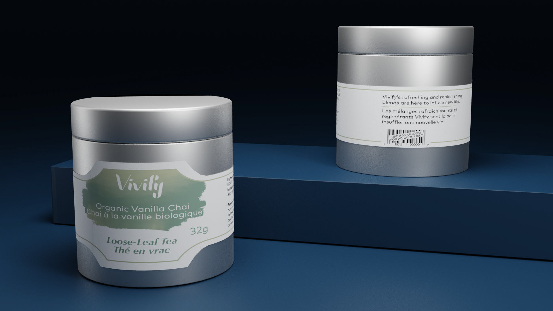
Vivify is the brand I created for this project. The word means “to breath life into something”, which positions these products as part of a healthy lifestyle brand. The wordmark is made to look high-end with its high contrast thicks and thins, but also has smoothed edges to give it a kinder appearance. The consistency is maintained all throughout the brand by having the wordmark be a knockout.
The different colours the logo is knocked out of reflect the different flavours available. The colours are reflected in the text and line elements present on each package as well to make them easy to differentiate. The design is similar in form across each package, which creates the pattern and consistency needed to recognize the brand.
All images provided were rendered in Blender.